Posts

Showing posts with the label Preliminary task

Flatplan vs Final

Image
Compared to my flatplan, I've kept it the same however there has been few developments, I've rotated the masthead "OLD" as the convention for this is to read it from top to bottom not bottom to top. I didn't use a graphic or border for my masthead however I did experiment but it was less suitable compared to my final. I've added a shadow for the name of the anchor which I didn't intend to do. According to my flatplan, I was supposed to keep the cover line font size the same and I initially wanted to add more colour than my final. However I am happy with my final cover.

Post about masthead

Image
This is my final masthead for my preliminary task. I used the fonts from Photoshop. I used a black font for melody because it's a common colour in a magazine and the font is serif because it's more professional. I chose a dirty green colour for old because it's the colour of my anchor's eyes so it relates to the image and also this is the extra colour I used and this colour is not very common in magazines. I did two layers for each word to give it a shadow effect and I also added effects for the coloured layers to stand out more.

Shot list

Image
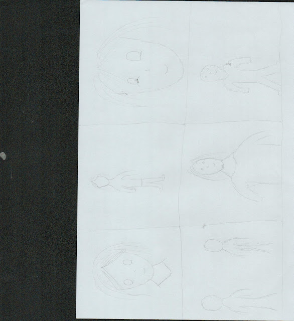
For my shot list, I've used various different shots.  1) For my first shot, I've used a mid close up to show the face and neck. The purpose of this shot is to show more detail on the face and less on the body language. 2) For my second shot, I've used a medium long shot to show the body language of the character. 3) For my third shot, I've created a close up to show the expressions of the character. 4) For my fourth shot, I've created a medium shot to show more body language and face expression. 5) For my fifth shot, I've created over the shoulder shot to show more character's expression. 6) For my last shot, I've created a long shot to show the scenery and the character's body language.

Feedback

Image

Consent forms

Image
These are the models I chose. I chose two because I feel like I would want to blend both of their characteristics.

Flat Plan

Image
As I'm creating the front cover for a classical music magazine, I've tried to keep the design as more modern but less hip hop looking. The title is going to be a san serif font as san serif is more formal. Also the title of the magazine is going to have a border around. The 2017 edition is there for it to look more professional as possible and make it look like a real magazine. The side and cover lines are to be aligned together with either black or white font. The anchor is going to be in the middle, the background is going to be changed to the image background or a light grey background. I'm not going to use any feature colours because it's going to be more black and white magazine. The title of the magazine is going to massive like the Elle magazine font. The teaser is going to be "Classical Music is real music" by the anchor. For my cover lines, I'm going to use graphics and use symbols such as + to boost the magazine. The teaser and the name of the an...
Image
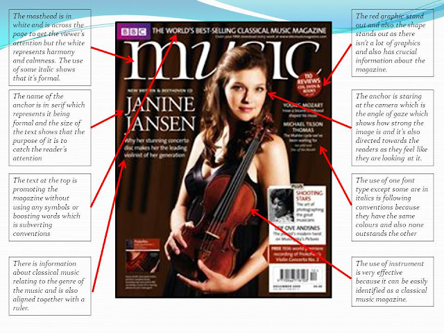
This is my magazine deconstruction. I've chosen a classical music magazine as I am doing the same genre so I'm going to deconstruct the magazine and look at common conventions to all magazines.

Reader profile

Image

Reasoning behind the idea of the magazine

Image

Initial ideas

This is me, explaining my initial ideas towards my preliminary task which is to create a front cover of a music magazine. I have decided to make a classical music magazine because it's more formal, professional and less mainstream. Typically most people would do hip hop or more urban so I wanted to do something different.

Photo choice

Image
  These are a couple of the photos I took. The biggest photo is the photo I used in the magazine cover because it's more natural and there is no distraction from the face with any accessories like the scarf at the images on the left and also I did experiment with different angle shots and different shots however the images aren't uploading onto blogger so I chose these image. This image is simple and its message is neutral compared to others.