Posts

Comment on telegraph
Image
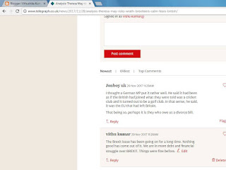
I posted a comment on the Daily Telegraph  online website about the BREXIT divorce bill.  I posted a comment on this particular story  because it was relevant and on the Daily  Telegraph website, it was a main story and  it is a subject that has been going for along time.  So I decided to comment on the process of the divorce issue and the concerns Theresa May is doing and so far how the Telegraph has portrayed May as she is the leading member of the Conservative Party as the Daily Telegraph is right wing.
Beauty product brand

Image

Film and Advertising

Image
Branding is an item made by a specific company under their name. Branding can be services, religion, people.  This relates to films as when it is advertised, it usually has a name which is used to increase the audience's trust into believing that it's a good film. It pushes people to watch something. Also, branding is used to show the expectations and their ideas of the film. For example, when we see a movie with the company logo of Disney, the audience immediately knows that it's targeted towards children. Branding was originally used by farmers where they use a hot cast iron to burn their cattle with a specific logo. However now it is developed into a different use. Films are also advertised through the internet (web 2.0). The audience is usually persuaded to watch a certain movie through information from the web. It can be reviews, trailers or any other platforms to boost the films expectation. Through web 2.0, more people can consume which means watch the film but also

Flatplan vs Final

Image
Compared to my flatplan, I've kept it the same however there has been few developments, I've rotated the masthead "OLD" as the convention for this is to read it from top to bottom not bottom to top. I didn't use a graphic or border for my masthead however I did experiment but it was less suitable compared to my final. I've added a shadow for the name of the anchor which I didn't intend to do. According to my flatplan, I was supposed to keep the cover line font size the same and I initially wanted to add more colour than my final. However I am happy with my final cover.

Post about masthead

Image
This is my final masthead for my preliminary task. I used the fonts from Photoshop. I used a black font for melody because it's a common colour in a magazine and the font is serif because it's more professional. I chose a dirty green colour for old because it's the colour of my anchor's eyes so it relates to the image and also this is the extra colour I used and this colour is not very common in magazines. I did two layers for each word to give it a shadow effect and I also added effects for the coloured layers to stand out more.

Shot list

Image
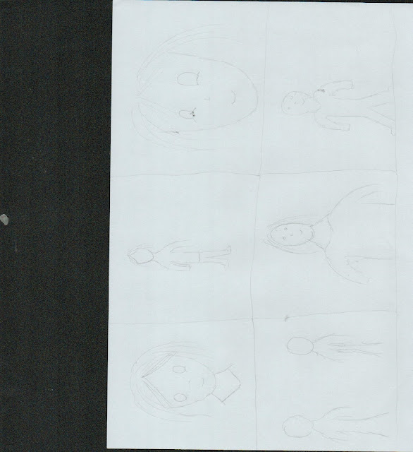
For my shot list, I've used various different shots.  1) For my first shot, I've used a mid close up to show the face and neck. The purpose of this shot is to show more detail on the face and less on the body language. 2) For my second shot, I've used a medium long shot to show the body language of the character. 3) For my third shot, I've created a close up to show the expressions of the character. 4) For my fourth shot, I've created a medium shot to show more body language and face expression. 5) For my fifth shot, I've created over the shoulder shot to show more character's expression. 6) For my last shot, I've created a long shot to show the scenery and the character's body language.

Feedback

Image