Media Theoretical Framework Media Language: How the director communicates with the audiences in certain ways such as the characters body language. In this image, it shows different examples of how body language can tell the audience about their character. Media Representation: How the media uses stereotypes, class groups of people In this image, it shows how Disney uses stereotypes to portray villains. Example: The villains in Disney always appear in red clothing, which means danger. Media Audiences: How media attains targets and address how audiences uses their product and respond to them. This image is about how singer Taylor Swift's song was interpretted by audiences and their response was the goat video. Media Industries: How the media industries process of production, distribution, and circulation affect media forms and platforms. Media Context: How the background story affects the products.
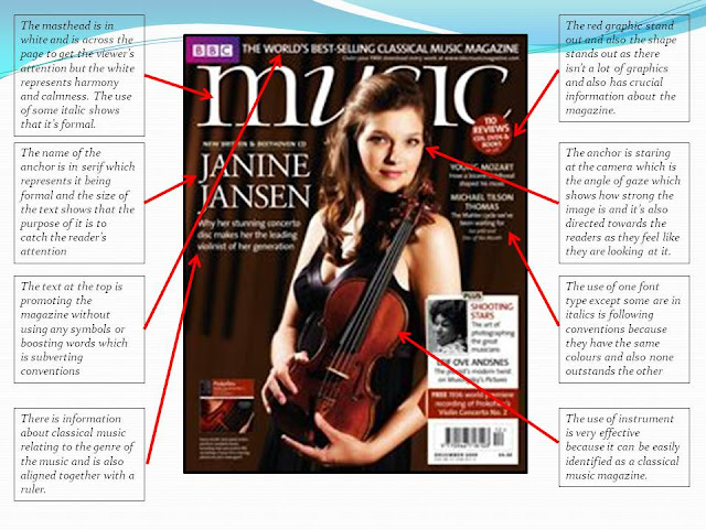
This is my magazine deconstruction. I've chosen a classical music magazine as I am doing the same genre so I'm going to deconstruct the magazine and look at common conventions to all magazines.


Comments
Post a Comment