Flat Plan
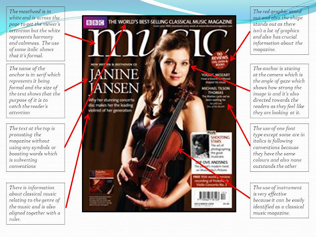
As I'm creating the front cover for a classical music magazine, I've tried to keep the design as more modern but less hip hop looking. The title is going to be a san serif font as san serif is more formal. Also the title of the magazine is going to have a border around. The 2017 edition is there for it to look more professional as possible and make it look like a real magazine. The side and cover lines are to be aligned together with either black or white font. The anchor is going to be in the middle, the background is going to be changed to the image background or a light grey background. I'm not going to use any feature colours because it's going to be more black and white magazine. The title of the magazine is going to massive like the Elle magazine font. The teaser is going to be "Classical Music is real music" by the anchor. For my cover lines, I'm going to use graphics and use symbols such as + to boost the magazine. The teaser and the name of the anchor is also going to be san serif with similar font type so it relates more to the anchor. It's going to look like a signature to look more authentic and in black. The reason why I chose this teaser is because this magazine is about promoting classical music and persuading people to listen to more classical music so I feel like this would boost things up. At the top corner, "MADE FOR YOU" is almost like propaganda. The purpose of that phrase, is to persuade people to buy this magazine because it's direct address. The barcode is going at the bottom corner as it isn't that relevant to the design.


Comments
Post a Comment